
Docusaurus allows you to add many types of navbar items to the navbar. But if you want to add a custom navbar item, you have to register a new type for your component. This guide will show you how to create a custom navbar item for Docusaurus.
Getting Started
We will create a dropdown navbar item that contains a list of colors. When we select a color, the background color of the website will change to the selected one.
There are two types of navbar items we have to register:
custom-colorPickerDropdown: This is the dropdown navbar item that contains a list of colors.custom-colorPicker: This is the navbar item that contains the color that we selected.
The custom- prefix is required for custom navbar item types.
These types will be registered by extending the Docusaurus default
NavbarItem/ComponentTypes exported object.
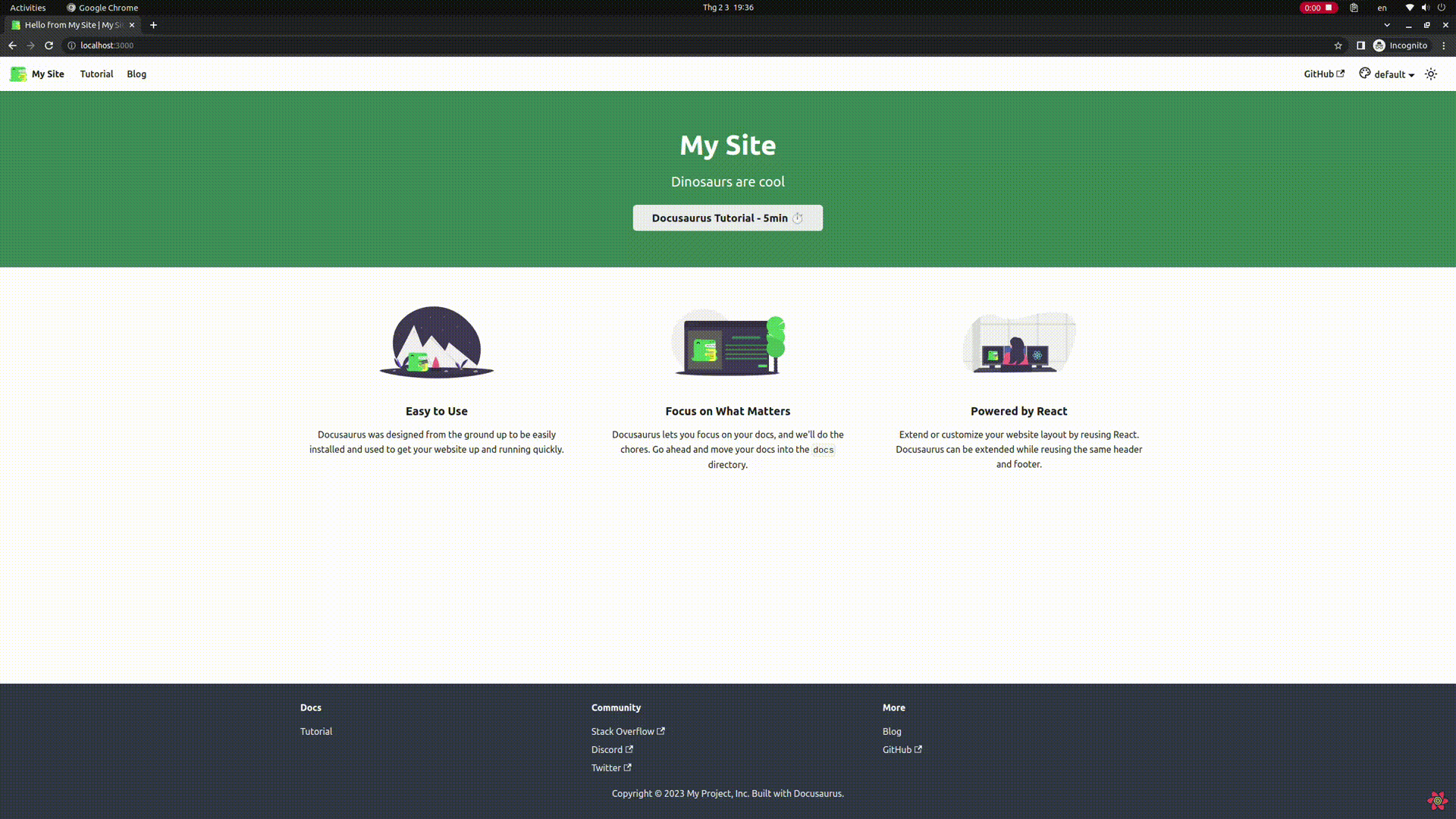
Our final result will look like this:
Types
Create a types.ts file to store the types of our custom navbar items:
typeandlabelare the required properties of a navbar item.coloris the color that we selected.
export type ColorConfig = {
  type?: string;
  label?: string;
  color?: 'red' | 'blue' | 'green' | 'default';
};
If an item is not provided with a label property, it will render an empty
<div> element, which kind of looks weird.
Create a provider to share the color state
You can use your own state management library (e.g. Redux Toolkit, Zustand, etc.) to manage the color state. But in this example, we will use React Context to manage the color state for simplicity.
When we shrink down the screen size to mobile size, the navbar will only hided
with display: none. So the dropdown navbar item still exists and a new
navbar is created as a sidebar. This means that the color state won't be
synced between the two navbar items. To solve this problem, we have to create
a provider to share the color state between the navbar and the sidebar (mobile).
Create a context:
src/components/elements/BgColorPicker/colorContext.tsximport { createContext } from 'react';
import { ColorConfig } from './types';
type ColorContextType = {
color: Omit<ColorConfig, 'type'>;
setColor: React.Dispatch<React.SetStateAction<Omit<ColorConfig, 'type'>>>;
};
export const ColorContext = createContext<ColorContextType>(null);Hm, why do we use
Omit<ColorConfig, 'type'>instead ofColorConfig? Because theColorPickerNavbarItemcomponent wasn't provided with atypeproperty, onlylabelandcolorare provided. So we have to omit thetypeproperty to keep the type consistent.Then create a provider:
src/components/elements/BgColorPicker/ColorPickerProvider.tsximport type { ThemeConfig } from '@docusaurus/preset-classic';
import useDocusaurusContext from '@docusaurus/useDocusaurusContext';
import React, { useEffect, useState } from 'react';
import { ColorContext } from '@site/src/components/elements/BgColorPicker/colorContext';
import type { ColorConfig } from '@site/src/components/elements/BgColorPicker/types';
const ColorPickerProvider = ({
children,
}: {
children?: React.ReactNode;
}) => {
const { siteConfig } = useDocusaurusContext();
const navbarItems = (siteConfig.themeConfig as ThemeConfig).navbar.items;
const defaultColor: ColorConfig = navbarItems.find((item) => {
return item.type === 'custom-colorPickerDropdown';
}).items[0];
const [color, setColor] = useState<Omit<ColorConfig, 'type'>>({
label: defaultColor.label,
color: defaultColor.color,
});
// eslint-disable-next-line consistent-return
useEffect(() => {
if (color?.color && color.color !== 'default') {
document.documentElement.style.setProperty(
'--ifm-background-color',
color.color,
);
}
return () => {
document.documentElement.style.setProperty(
'--ifm-background-color',
'#0000',
);
};
}, [color]);
return (
<ColorContext.Provider
value={{
color,
setColor,
}}
>
{children}
</ColorContext.Provider>
);
};
export { ColorPickerProvider };We use the
useDocusaurusContexthook to get thesiteConfigobject that has the navbar items we defined indocusaurus.config.js.Extract the first entry of the
itemsproperty of thecustom-colorPickerDropdownnavbar item. This is the default color that we will use when the user visits the website for the first time.tipIt's recommended that you set
defaultas the first color in theitemsproperty. So it won't affect the background color of the website when the user visits the website for the first time.We use the
useEffecthook to set the--ifm-background-colorCSS variable to the selected color. We also set the--ifm-background-colorCSS variable to#0000(default value from Docusaurus) when the component is unmounted.Finally, we pass the
colorandsetColorto theColorContextso that theColorPickerNavbarItemcan access it.
Finally, wrap the
Roottheme component with the provider:src/theme/Root.tsximport React from 'react';
import { ColorPickerProvider } from '@site/src/context/ColorPickerProvider';
// Default implementation, that you can customize
export default function Root({ children }: { children?: React.ReactNode }) {
return <ColorPickerProvider>{children}</ColorPickerProvider>;
}cautionYou should aware that the
Rootcomponent is not mentioned whether it is Safe or Unsafe by running the commandpnpm swizzle.
Create a dropdown navbar item component
Create a wrapper component for the default DropdownNavbarItem component:
import { Icon } from '@iconify/react';
import type { Props } from '@theme/NavbarItem/DropdownNavbarItem';
import DropdownNavbarItem from '@theme/NavbarItem/DropdownNavbarItem';
import React, { useContext } from 'react';
import { ColorContext } from './colorContext';
import type { ColorConfig } from './types';

const ColorPickerDropdownNavbarItem = ({
  mobile = false,
  ...props
}: {
  items: ColorConfig[];
} & Props) => {
  const context = useContext(ColorContext);

  // Ref: https://github.com/facebook/docusaurus/blob/main/packages/docusaurus-theme-classic/src/theme/NavbarItem/LocaleDropdownNavbarItem/styles.module.css
  const navbarLabel = (
    <>
      <Icon
        className="mr-5px align-text-bottom"
        icon="ic:outline-palette"
        width={24}
      />
      {mobile ? props.label : context?.color?.label}
    </>
  );

  return <DropdownNavbarItem mobile={mobile} {...props} label={navbarLabel} />;
};

export { ColorPickerDropdownNavbarItem };
First, we have to intersect the
Propstype of the defaultDropdownNavbarItemwith of our customitemsproperty. This is because the defaultDropdownNavbarItemitemsproperty is of typeLinkLikeNavbarItemProps[]. Theitemsprop has value of theitemsproperty of thecustom-colorPickerDropdownnavbar item, defined in thedocusaurus.config.jsfile.We can create a custom label with icon, like the
LocaleDropdownNavbarItemcomponent. We use thecontextto get the selected color label. On the desktop, it displays the selected color label. On mobile, it displays thelabelprop of thecustom-colorPickerDropdownnavbar item.
Create a navbar item component
Create the ColorPickerNavbarItem component:
import type { Props } from '@theme/NavbarItem/DefaultNavbarItem';
import clsx from 'clsx';
import React, { ComponentProps, useContext } from 'react';
import { ColorContext } from './colorContext';
import type { ColorConfig } from './types';

type ColorPickerNavbarItemProps = Omit<Props, keyof ComponentProps<'a'>> &
  ComponentProps<'div'>;

const DefaultColorPickerNavbarItem = ({
  label,
  className,
  isDropdownItem = false,
  activeClassName,
  isLinkActive,
  mobile,
  ...props
}: {
  isLinkActive: boolean;
} & ColorPickerNavbarItemProps) => {
  const element = (
    <div
      className={clsx(
        isDropdownItem && (mobile ? 'menu__link' : 'dropdown__link'),
        className,
        isLinkActive && activeClassName,
      )}
      {...props}
    >
      {label}
    </div>
  );

  if (isDropdownItem) {
    return <li className={clsx(mobile && 'menu__list-item')}>{element}</li>;
  }

  return element;
};

const ColorPickerNavbarItem = ({
  label,
  color,
  mobile,
  ...props
}: Omit<ColorConfig, 'type'> & ColorPickerNavbarItemProps) => {
  const context = useContext(ColorContext);

  const handleClick = () => {
    context?.setColor({ label, color });
  };

  return (
    <DefaultColorPickerNavbarItem
      {...props}
      activeClassName={
        props.activeClassName ??
        (mobile ? 'menu__link--active' : 'dropdown__link--active')
      }
      isLinkActive={context?.color?.color === color}
      label={label}
      mobile={mobile}
      onClick={handleClick}
    />
  );
};

export { ColorPickerNavbarItem };
First, because we render a
<div>element instead of an<a>element, we have to omit thePropstype of the defaultDefaultNavbarItemthat contains theaelement props.noteAlthough the type
ColorPickerNavbarItemPropsstill has theRRNavLinkProps, which is react-router-dom's props and others, that are not used in the component, we don't care much about it.This component is rewritten from the default
DefaultNavbarItemcomponent, which merge bothDefaultNavbarItemDesktopandDefaultNavbarItemMobileinto a single component.
Export navbar item components
Export the ColorPickerDropdownNavbarItem and ColorPickerNavbarItem components:
export * from './DropdownNavbarItem';
export * from './NavbarItem';
Register custom navbar items
We will register the custom navbar items in the NavbarItem/ComponentTypes
file:
import ComponentTypes from '@theme-original/NavbarItem/ComponentTypes';
import {
  ColorPickerDropdownNavbarItem,
  ColorPickerNavbarItem,
} from '@site/src/components/elements/BgColorPicker';

export default {
  ...ComponentTypes,
  'custom-colorPickerDropdown': ColorPickerDropdownNavbarItem,
  'custom-colorPicker': ColorPickerNavbarItem,
};
Once again, the custom- prefix is required when registering custom navbar
items. From slorber's
suggestion.
Add navbar item to navbar
Add the custom navbar items to the navbar in the file dousaurus.config.js:
const config = {
  themeConfig: {
    navbar: {
      items: [
        {
          type: 'custom-colorPickerDropdown',
          position: 'right',
          label: 'Color',
          items: [
            {
              type: 'custom-colorPicker',
              label: 'default',
              color: 'default',
            },
            {
              type: 'custom-colorPicker',
              label: 'red',
              color: 'red',
            },
            {
              type: 'custom-colorPicker',
              label: 'blue',
              color: 'blue',
            },
            {
              type: 'custom-colorPicker',
              label: 'green',
              color: 'green',
            },
          ],
        },
      ],
    },
  },
};
And voila! We have a working color picker in the navbar.