Docusaurus is an excellent tool for building
documentation websites. However, it does not support
WindiCSS out of the box.
Mantine is a React UI library that provides a lot of UI
components and hooks, so you can use them to build your components.
This guide will show you how to integrate WindiCSS and Mantine with Docusaurus.
We will go through setting up these features:
- ✅ WindiCSS
- ✅ Mantine
- ✅ Dark mode
- ✅ Typography
- ✅ Colors
Currently, there are some bugs with WindiCSS Devtool in windicss-webpack-plugin
package, which are
reported in
#118
and
#115.
First, we need to set up a Docusaurus project. You can follow the official guide
from Docusaurus website:
pnpm create docusaurus demo-docs classic
Then, we have this project structure:
.
├── babel.config.js
├── blog
├── docs
├── docusaurus.config.js
├── node_modules
├── package.json
├── pnpm-lock.yaml
├── README.md
├── sidebars.js
├── src
│   ├── components
│   ├── css
│   └── pages
└── static
    └── img
We will have to install windicss and
windicss-webpack-plugin
package:
pnpm add -D windicss windicss-webpack-plugin
Following the official guide
from WindiCSS, we have to configure Webpack to use the windicss-webpack-plugin.
Because the file webpack.config.ts somehow is not loaded by Docusaurus, we
have to configure Webpack manually in the file docusaurus.config.js by
creating a custom Docusaurus
plugin:
docusaurus.config.js
const WindiCSSWebpackPlugin = require('windicss-webpack-plugin');
const config = {
plugins: [
function windicssPlugin() {
return {
name: 'windicss-plugin',
configureWebpack() {
return {
plugins: [new WindiCSSWebpackPlugin()],
};
},
};
},
],
};
module.exports = config;
It's recommended to include the WindiCSS virtual module within an entry point
file or something only loaded once.
However, Docusaurus does not have an entry file like index.js or index.ts,
so we have to "swizzle" the Root
component by creating a wrapper around it to import the module.
The <Root> component is rendered at the very top of the React tree, above
the theme <Layout>, and never unmounts. It is the perfect place to add
stateful logic that should not be re-initialized across navigations (user
authentication status, shopping card state...).
You should aware that the Root component is not mentioned whether it is
Safe or Unsafe by running the command pnpm swizzle.
Import all three layers:
src/theme/Root.tsx
import React from 'react';
import 'windi.css';
export default function Root({ children }: { children?: React.ReactNode }) {
return <>{children}</>;
}
Because the file windi-base.css overrides the default styles of
Docusaurus, so I recommend not importing it:
src/theme/Root.tsx
import React from 'react';
-import 'windi.css';
+import 'windi-components.css';
+import 'windi-utilities.css';

// Default implementation, that you can customize
export default function Root({ children }: { children?: React.ReactNode }) {
  return <>{children}</>;
}
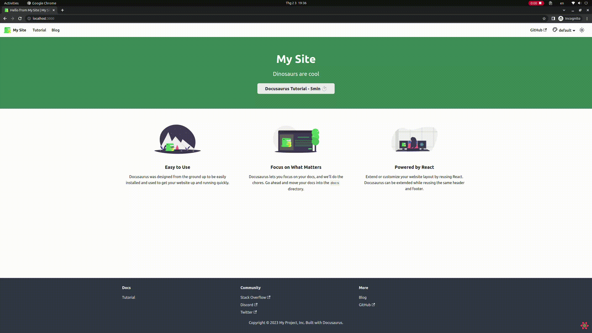
Now, we can test the result by writing some classes in HomepageHeader
the component in the file src/pages/index.tsx:
src/pages/index.tsx
function HomepageHeader() {
const { siteConfig } = useDocusaurusContext();
return (
<header className="bg-blue-500">
<div className="container mx-auto text-center py-24">
<h1 className="text-4xl font-bold text-white">{siteConfig.title}</h1>
<p className="text-xl py-6 text-white">{siteConfig.tagline}</p>
<div className="py-10">
<Link
className="bg-white rounded-md text-gray-500 px-4 py-2"
to="/docs/intro"
>
Docusaurus Tutorial - 5min ⏱️
</Link>
</div>
</div>
</header>
);
}
And we can see the result:

You can configure WindiCSS by creating a file windi.config.ts in the root
directory.
Windi CSS has out-of-box Dark Mode support.
By prefixing the dark: variant to utilities, they will only apply when dark
mode is enabled.
We have two modes for enabling dark mode, class
mode and media query
mode. By
default, class mode is enabled.
Enable dark mode using class mode:
windi.config.ts
export default {
  darkMode: 'class',
};
To manually add class dark to the <html> element, we can add some logic in
the Layout/Provider wrapper:
- Add or remove the class
dark based on the color scheme.
src/theme/Layout/Provider/index.tsx
import { useColorMode } from '@docusaurus/theme-common';
import { ColorSchemeProvider } from '@mantine/core';
import Provider from '@theme-original/Layout/Provider';
import React, { useEffect } from 'react';
import { MantineProvider } from '@site/src/context/MantineProvider';
const CustomProvider = ({ children }: { children?: React.ReactNode }) => {
const { colorMode, setColorMode } = useColorMode();
useEffect(() => {
if (colorMode === 'dark') {
document.documentElement.classList.add('dark');
} else if (colorMode === 'light') {
document.documentElement.classList.remove('dark');
}
}, [colorMode]);
return <>{children}</>;
};
export default function ProviderWrapper({
children,
...props
}: {
children?: React.ReactNode;
}) {
return (
<Provider {...props}>
<CustomProvider>{children}</CustomProvider>
</Provider>
);
}
The useColorMode hook MUST be called inside the ProviderWrapper component.
That's why I have to create a separate component CustomProvider to wrap the
useColorMode hook.
Another approach by swizzling the ColorModeToggle component
This approach is considered simpler than the previous one because the color mode
is already passed to the ColorModeToggle component.
The ColorModeToggle component is Safe to swizzle:
src/theme/ColorModeToggle.tsx
import ColorModeToggle from '@theme-original/ColorModeToggle';
import type { Props } from '@theme/ColorModeToggle';
import React, { useEffect } from 'react';

export default function ColorModeToggleWrapper(props: Props) {
  const { value: colorMode } = props;

  useEffect(() => {
    if (colorMode === 'dark') {
      document.documentElement.classList.add('dark');
    } else if (colorMode === 'light') {
      document.documentElement.classList.remove('dark');
    }
  }, [colorMode]);

  return (
    <>
      <ColorModeToggle {...props} />
    </>
  );
}
This approach only works when the color mode switch is enabled. If you disable
the button by setting themeConfig.colorMode.disableSwitch to true in the
file docusaurus.config.js, the ColorModeToggle component will not be
rendered.
Why don't we use hook useColorMode?
Yes, you can, but the color mode is already passed to the component as a prop,
we can use it directly.
Error: "Hook useColorMode is called outside the <ColorModeProvider>"
If you have this error and you are using pnpm, then you may have hoisting
package issue
(#7880
and
#6724).
You can fix it by adding the following code to the file .npmrc:
.npmrc
public-hoist-pattern[]=@docusaurus/theme-common*
WindiCSS font family utilities (font-sans, font-serif, font-mono)
configured fonts are quite different from the ones configured in Docusaurus. So
we can configure the fonts in windi.config.ts to match with Docusaurus
configurations:
- Font family base from variable
--ifm-font-family-base. - Font family mono from variable
--ifm-font-family-monospace. - Font family serif is not present in Docusaurus, so we can use the default
value.
windi.config.ts
export default {
  theme: {
    extend: {
      fontFamily: {
        sans: 'system-ui,-apple-system,Segoe UI,Roboto,Ubuntu,Cantarell,Noto Sans,sans-serif,BlinkMacSystemFont,"Segoe UI",Helvetica,Arial,sans-serif,"Apple Color Emoji","Segoe UI Emoji","Segoe UI Symbol"',
        mono: 'SFMono-Regular,Menlo,Monaco,Consolas,"Liberation Mono","Courier New",monospace',
      },
    },
  },
};
To add quick animations to your site, you can use WindiCSS's animation default
utilities, but it's quite limited. So we can install the plugin
@windicss/plugin-animations to add more animations utilities from Animate
CSS
Install the plugin:
pnpm add -D @windicss/plugin-animations
Add the plugin to windi.config.ts:
windi.config.ts
import pluginAnimations from '@windicss/plugin-animations';
export default {
plugins: [
pluginAnimations({
settings: {
},
}),
],
};
Then you can use the animation utilities:
src/pages/index.tsx
function HomepageHeader() {
return (
<p className="animate-animated animate-infinite animate-rubberBand">
Hello World
</p>
);
}
To configure the attributify mode, we can configure it in windi.config.ts:
windi.config.ts
export default {
  attributify: true,
};
Then you can use the WindiCSS utilities as HTML attributes:
src/pages/index.tsx
function HomepageHeader() {
return (
<button
bg="blue-400 hover:blue-500 dark:blue-500 dark:hover:blue-600"
text="sm white"
font="mono light"
p="y-2 x-4"
border="2 rounded blue-200"
>
Button
</button>
);
}
Since Mantine also provides some default
props for all
components, like: p, px, py, m, mx, my,... so if you use the
attributify mode, you should add a prefix to the WindiCSS utilities to avoid
conflicts. For example, you can setup the prefix w: for WindiCSS utilities:
windi.config.ts
export default {
  attributify: {
    prefix: 'w:',
  },
};
Then you can use the WindiCSS utilities as HTML attributes:
src/pages/index.tsx
function HomepageHeader() {
return (
<button
w:bg="blue-400 hover:blue-500 dark:blue-500 dark:hover:blue-600"
w:text="sm white"
w:font="mono light"
w:p="y-2 x-4"
w:border="2 rounded blue-200"
>
Button
</button>
);
}
Docusaurus configured primary colors from src/css/custom.css:
src/css/custom.css
:root {
--ifm-color-primary: #2e8555;
--ifm-color-primary-dark: #29784c;
--ifm-color-primary-darker: #277148;
--ifm-color-primary-darkest: #205d3b;
--ifm-color-primary-light: #33925d;
--ifm-color-primary-lighter: #359962;
--ifm-color-primary-lightest: #3cad6e;
--ifm-code-font-size: 95%;
--docusaurus-highlighted-code-line-bg: rgba(0, 0, 0, 0.1);
}
[data-theme='dark'] {
--ifm-color-primary: #25c2a0;
--ifm-color-primary-dark: #21af90;
--ifm-color-primary-darker: #1fa588;
--ifm-color-primary-darkest: #1a8870;
--ifm-color-primary-light: #29d5b0;
--ifm-color-primary-lighter: #32d8b4;
--ifm-color-primary-lightest: #4fddbf;
--docusaurus-highlighted-code-line-bg: rgba(0, 0, 0, 0.3);
}
We can configure WindiCSS to use these in class as well:
windi.config.ts
export default {
  theme: {
    extend: {
      colors: {
        primary: {
          DEFAULT: '#2e8555',
          dark: '#29784c',
          darker: '#277148',
          darkest: '#205d3b',
          light: '#33925d',
          lighter: '#359962',
          lightest: '#3cad6e',
        },
        'dark-primary': {
          DEFAULT: '#25c2a0',
          dark: '#21af90',
          darker: '#1fa588',
          darkest: '#1a8870',
          light: '#29d5b0',
          lighter: '#32d8b4',
          lightest: '#4fddbf',
        },
      },
    },
  },
};
Then you can use Docusaurus primary colors in class:
src/pages/index.tsx
function HomepageHeader() {
return (
<p className="bg-primary hover:bg-primary-dark dark:bg-dark-primary dark:hover:bg-dark-primary-dark">
Hello World
</p>
);
}
pnpm add @mantine/core @mantine/hooks @emotion/react
In this step, we will add Mantine Provider to the <Root> to
ensure that all Mantine components are using the same theme.
src/theme/Root.tsx
+import { MantineProvider } from '@mantine/core';
import React from 'react';
// eslint-disable-next-line import/no-unresolved
import 'windi-components.css';
// eslint-disable-next-line import/no-unresolved
import 'windi-utilities.css';

// Default implementation, that you can customize
export default function Root({ children }: { children?: React.ReactNode }) {
  return (
-     <>{children}</>
+     <MantineProvider>{children}</MantineProvider>
  );
}
This is just a basic setup, we will use our custom <MantineProvider> in the
next step.
In this file, we will configure the Mantine Provider to use the WindiCSS theme
(colors, fonts, breakpoints, etc) and Docusaurus theme (colors, fonts, etc), so
we can ensure the consistency between the Docusaurus site, Mantine components,
and WindiCSS utilities.
src/context/MantineProvider.tsx
import {
MantineProvider as BaseMantineProvider,
Global,
MantineTheme,
DEFAULT_THEME as mantineDefaultTheme,
} from '@mantine/core';
import type { MantineSizes } from '@mantine/core';
import React from 'react';
import windiDefaultColors from 'windicss/colors';
import windiDefaultTheme from 'windicss/defaultTheme';
import type { DefaultColors } from 'windicss/types/config/colors';
import type { DefaultFontSize, ThemeType } from 'windicss/types/interfaces';
import type { MantineThemeColors } from '@site/src/types/MantineThemeColors';
const convertBreakpoint = (breakpoint: ThemeType): MantineSizes => {
const convertedBreakpoint = {} as MantineSizes;
Object.keys(breakpoint).forEach((size) => {
convertedBreakpoint[size] = +breakpoint[size].replace('px', '');
});
return convertedBreakpoint;
};
const convertColor = (windiColors: DefaultColors) => {
const convertedColor = {} as MantineThemeColors;
Object.keys(windiColors).forEach((color) => {
if (color === 'lightBlue') {
color = 'sky';
} else if (color === 'warmGray') {
color = 'stone';
} else if (color === 'trueGray') {
color = 'neutral';
} else if (color === 'coolGray') {
color = 'gray';
} else if (color === 'blueGray') {
color = 'slate';
} else if (color === 'zink') {
color = 'zinc';
}
if (windiColors[color] instanceof Object) {
convertedColor[color] = Object.values(windiColors[color]);
}
});
convertedColor.dark = convertedColor.zinc;
return convertedColor;
};
const convertFontSize = (fontSize: {
[key: string]: DefaultFontSize;
}): MantineSizes => {
const convertedFontSize = {} as MantineSizes;
Object.keys(fontSize).forEach((size) => {
convertedFontSize[size] = fontSize[size][0];
});
return convertedFontSize;
};
const theme: MantineTheme = {
...mantineDefaultTheme,
breakpoints: {
...mantineDefaultTheme.breakpoints,
...convertBreakpoint(windiDefaultTheme.screens),
},
colors: {
...mantineDefaultTheme.colors,
...convertColor(windiDefaultColors),
},
defaultRadius: 'md',
black: windiDefaultColors.black as string,
white: windiDefaultColors.white as string,
primaryColor: 'blue',
fontSizes: {
...mantineDefaultTheme.fontSizes,
...convertFontSize(windiDefaultTheme.fontSize),
},
radius: {
...mantineDefaultTheme.radius,
},
fontFamily:
'system-ui,-apple-system,Segoe UI,Roboto,Ubuntu,Cantarell,Noto Sans,sans-serif,BlinkMacSystemFont,"Segoe UI",Helvetica,Arial,sans-serif,"Apple Color Emoji","Segoe UI Emoji","Segoe UI Symbol"',
fontFamilyMonospace:
'SFMono-Regular,Menlo,Monaco,Consolas,"Liberation Mono","Courier New",monospace',
headings: {
...mantineDefaultTheme.headings,
fontFamily:
'system-ui,-apple-system,Segoe UI,Roboto,Ubuntu,Cantarell,Noto Sans,sans-serif,BlinkMacSystemFont,"Segoe UI",Helvetica,Arial,sans-serif,"Apple Color Emoji","Segoe UI Emoji","Segoe UI Symbol"',
},
lineHeight: mantineDefaultTheme.lineHeight,
loader: 'oval',
shadows: {
...mantineDefaultTheme.shadows,
...windiDefaultTheme.boxShadow,
},
};
const MyGlobalStyles = () => {
return (
<Global
styles={{
'html.dark': {
img: {
filter: 'brightness(.8) contrast(1.2)',
},
},
}}
/>
);
};
type MantineProps = {
children: React.ReactNode;
theme?: Partial<MantineTheme>;
};
const MantineProvider = ({
children,
theme: themeProps,
...props
}: MantineProps) => {
return (
<BaseMantineProvider theme={{ ...theme, ...themeProps }} {...props}>
<MyGlobalStyles />
{children}
</BaseMantineProvider>
);
};
export { MantineProvider };
Use our custom <MantineProvider> in src/theme/Layout/Provider/index.tsx:
src/theme/Layout/Provider/index.tsx
import { useColorMode } from '@docusaurus/theme-common';
import Provider from '@theme-original/Layout/Provider';
import React, { useEffect } from 'react';
+import { MantineProvider } from '@site/src/context/MantineProvider';

const CustomProvider = ({ children }) => {
  const { colorMode, setColorMode } = useColorMode();

  useEffect(() => {
    if (colorMode === 'dark') {
      document.documentElement.classList.add('dark');
    } else if (colorMode === 'light') {
      document.documentElement.classList.remove('dark');
    }
  }, [colorMode]);

- return <>{children}</>;
+ return (
+   <MantineProvider>
+     {children}
+   </MantineProvider>
+ );
};

export default function ProviderWrapper({ children, ...props }) {
  return (
    <Provider {...props}>
      <CustomProvider>{children}</CustomProvider>
    </Provider>
  );
}
We will pass the color mode to Mantine using the ColorSchemeProvider component
and theme.colorScheme props:
src/theme/Layout/Provider/index.tsx
import { useColorMode } from '@docusaurus/theme-common';
+import { ColorSchemeProvider } from '@mantine/core';
import Provider from '@theme-original/Layout/Provider';
import React, { useEffect } from 'react';
+import { MantineProvider } from '@site/src/context/MantineProvider';

const CustomProvider = ({ children }) => {
  const { colorMode, setColorMode } = useColorMode();

  useEffect(() => {
    if (colorMode === 'dark') {
      document.documentElement.classList.add('dark');
    } else if (colorMode === 'light') {
      document.documentElement.classList.remove('dark');
    }
  }, [colorMode]);

+ const toggleColorScheme = (value) =>
+   setColorMode(value || (colorMode === 'dark' ? 'light' : 'dark'));

- return (
-   <MantineProvider>
-     {children}
-   </MantineProvider>
- );
+ return (
+   <ColorSchemeProvider
+     colorScheme={colorMode}
+     toggleColorScheme={toggleColorScheme}
+   >
+     <MantineProvider theme={{ colorScheme: colorMode }}>
+       {children}
+     </MantineProvider>
+   </ColorSchemeProvider>
+ );
};

export default function ProviderWrapper({ children, ...props }) {
  return (
    <Provider {...props}>
      <CustomProvider>{children}</CustomProvider>
    </Provider>
  );
}
So now we can use the useMantineColorScheme (or useColorMode from
Docusaurus) hook to get the color mode:
src/pages/index.tsx
import { Button, useMantineColorScheme } from '@mantine/core';
function HomepageHeader() {
const { siteConfig } = useDocusaurusContext();
const { colorScheme, toggleColorScheme } = useMantineColorScheme();
const dark = colorScheme === 'dark';
return (
<header className={clsx('hero hero--primary', styles.heroBanner)}>
<div className="container">
<h1 className="hero__title">{siteConfig.title}</h1>
<p className="hero__subtitle">{siteConfig.tagline}</p>
<div className={styles.buttons}>
<Link
className="button button--secondary button--lg"
to="/docs/intro"
>
Docusaurus Tutorial - 5min ⏱️
</Link>
</div>
<Button
variant="outline"
onClick={() => toggleColorScheme()}
title="Toggle color scheme"
>
{dark ? 'dark' : 'light'}
</Button>
</div>
</header>
);
}
The useMantineColorScheme (or useColorMode) hook MUST be called inside the
Layout component.
We will have to convert font sizes from WindiCSS types to Mantine types, apply
font-family (from Docusaurus) and line-height:
For example:
| WindiCSS sample | Mantine sample |
|---|
{
  "xs": [
    "0.75rem",
    {
      "lineHeight": "1rem"
    }
  ]
}
| |
src/context/MantineProvider.tsx
import {
MantineTheme,
DEFAULT_THEME as mantineDefaultTheme,
} from '@mantine/core';
import type { MantineSizes } from '@mantine/core';
import { DEFAULT_THEME as mantineDefaultTheme } from '@mantine/core';
import windiDefaultTheme from 'windicss/defaultTheme';
import type { DefaultFontSize } from 'windicss/types/interfaces';
const convertFontSize = (fontSize: {
[key: string]: DefaultFontSize;
}): MantineSizes => {
const convertedFontSize = {} as MantineSizes;
Object.keys(fontSize).forEach((size) => {
convertedFontSize[size] = fontSize[size][0];
});
return convertedFontSize;
};
const theme: MantineTheme = {
...mantineDefaultTheme,
fontSizes: {
...mantineDefaultTheme.fontSizes,
...convertFontSize(windiDefaultTheme.fontSize),
},
fontFamily:
'system-ui,-apple-system,Segoe UI,Roboto,Ubuntu,Cantarell,Noto Sans,sans-serif,BlinkMacSystemFont,"Segoe UI",Helvetica,Arial,sans-serif,"Apple Color Emoji","Segoe UI Emoji","Segoe UI Symbol"',
fontFamilyMonospace:
'SFMono-Regular,Menlo,Monaco,Consolas,"Liberation Mono","Courier New",monospace',
headings: {
...mantineDefaultTheme.headings,
fontFamily:
'system-ui,-apple-system,Segoe UI,Roboto,Ubuntu,Cantarell,Noto Sans,sans-serif,BlinkMacSystemFont,"Segoe UI",Helvetica,Arial,sans-serif,"Apple Color Emoji","Segoe UI Emoji","Segoe UI Symbol"',
},
lineHeight: mantineDefaultTheme.lineHeight,
};
At this step, we have to convert the WindiCSS color types to Mantine color types
and remove unused colors.
We will use the default Mantine dark color, instead of WindiCSS dark color
for better contrast. Moreover, we will set primaryShade to 7.
For example:
| WindiCSS sample | Mantine sample |
|---|
{
  "amber": {
    "50": "#fffbeb",
    "100": "#fef3c7",
    "200": "#fde68a",
    "300": "#fcd34d",
    "400": "#fbbf24",
    "500": "#f59e0b",
    "600": "#d97706",
    "700": "#b45309",
    "800": "#92400e",
    "900": "#78350f"
  }
}
| {
"amber": [
"#fffbeb",
"#fef3c7",
"#fde68a",
"#fcd34d",
"#fbbf24",
"#f59e0b",
"#d97706",
"#b45309",
"#92400e",
"#78350f"
]
}
|
src/context/MantineProvider.tsx
import {
MantineTheme,
DEFAULT_THEME as mantineDefaultTheme,
} from '@mantine/core';
import windiDefaultColors from 'windicss/colors';
import type { DefaultColors } from 'windicss/types/config/colors';
import type { MantineThemeColors } from '@site/src/types/MantineThemeColors';
const convertColor = (windiColors: DefaultColors) => {
const convertedColor = {} as MantineThemeColors;
Object.keys(windiColors).forEach((color) => {
if (color === 'lightBlue') {
color = 'sky';
} else if (color === 'warmGray') {
color = 'stone';
} else if (color === 'trueGray') {
color = 'neutral';
} else if (color === 'coolGray') {
color = 'gray';
} else if (color === 'blueGray') {
color = 'slate';
} else if (color === 'zink') {
color = 'zinc';
}
if (windiColors[color] instanceof Object) {
convertedColor[color] = Object.values(windiColors[color]);
}
});
convertedColor.dark = mantineDefaultTheme.colors.dark;
return convertedColor;
};
const theme: MantineTheme = {
...mantineDefaultTheme,
colors: {
...mantineDefaultTheme.colors,
...convertColor(windiDefaultColors),
},
black: windiDefaultColors.black as string,
white: windiDefaultColors.white as string,
primaryColor: 'blue',
primaryShade: 7,
};